Distorted Moon
The Importance of Focal Length
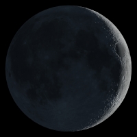
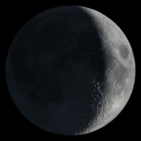
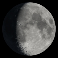
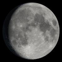
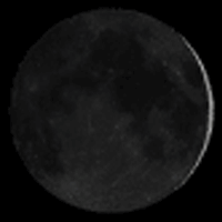
The images in the top row of this array come from the U.S. Naval Observatory website, and those on the bottom come from mine. The image pairs in each column are intended to represent the same phase angle, but there's a problem with the USNO images. Can you spot what it is?
 |
 |
 |
 |
 |
 |
 |
 |
 |
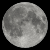 |
Both sets of images were created by rendering a simulated Moon in 3D animation software. The Moon is modeled in the software as a sphere with the Clementine surface map wrapped around it. The virtual camera is pointed at the near side of the Moon, and a light source simulating sunlight is put in orbit around the Moon sphere. Saving frames of the animation as the light revolves around the Moon produces a set of files with a full range of phase angles. The page where these are displayed just needs to calculate a phase angle and pick the corresponding image.
It's a simple process for an experienced 3D artist. But in the fall of 2005, the webmaster of a Midwestern amateur astronomy club noticed (and posted on the sci.astro.amateur newsgroup, which is how it came to my attention) that the USNO images didn't seem to match what he saw in the sky. Crescent phases looked too thin, and gibbous phases looked too fat.
The explanation for this is straightforward: The camera was put too close to the Moon!
When we look at a sphere, we see somewhat less than a complete hemisphere. How much less depends in a pretty simple way on how much of the field of view the sphere is filling. If the sphere subtends an angle a, the part of it we can see, in degrees, is 180 – a.
Most 3D programs default to a field of view that's equivalent to a fairly wide-angle camera lens, 45 (3DS Max, LightWave) to 55 (Maya, XSI) degrees horizontally. If you've positioned your Moon object so that it fills this FOV, without thinking about the real situation you're modeling, you get a foreshortened, almost fish-eye view that doesn't match what the real Moon, subtending only half a degree, looks like from Earth.
This affects both the look of the phases and the visibility of lunar surface features. Mare Imbrium, the round, dark patch at about the 11 o'clock position, is disappearing over the northwestern horizon in the USNO images, and the Tranquillitatis and Serenitatis maria, the adjacent pair of dark areas between 12 and 3 o'clock (and landing sites of Apollo 11 and 17) loom much larger than they should.
Someone at USNO knew there was something wrong with the images. The page
where they appear refers vaguely to geometric distortion.
I've also
written to the USNO webmaster address explaining the precise nature of the
problem and offering my own images as a substitute (with no reply). The USNO
certainly has the capability to do this right themselves, as the much more
sophisticated rendering elsewhere on its site
demonstrates.
But the convenience and utility of the incorrect pocket size images has made them attractive to webmasters everywhere. They appear on dozens of astronomy club sites and a handful of major commercial ones (here on Space.com, for example), and links to the USNO page appear on thousands more.
Is this a big deal? Not really. As cartoons, the images are accurate enough for the vast majority of people, who have no more than a casual interest in the current phase of the Moon. Those with more demanding needs can find much better data. This is more a cautionary tale about the importance and legitimacy of artistic knowledge in scientific visualization. If you want your scientific image to tell the truth, you have to respect the art, the physics and psychology of perception and communication, just as much as the science.
